Adrian Leks, PR & Marketing Manager
How to create a website suitable for Mobile Devices? [case study]
BACK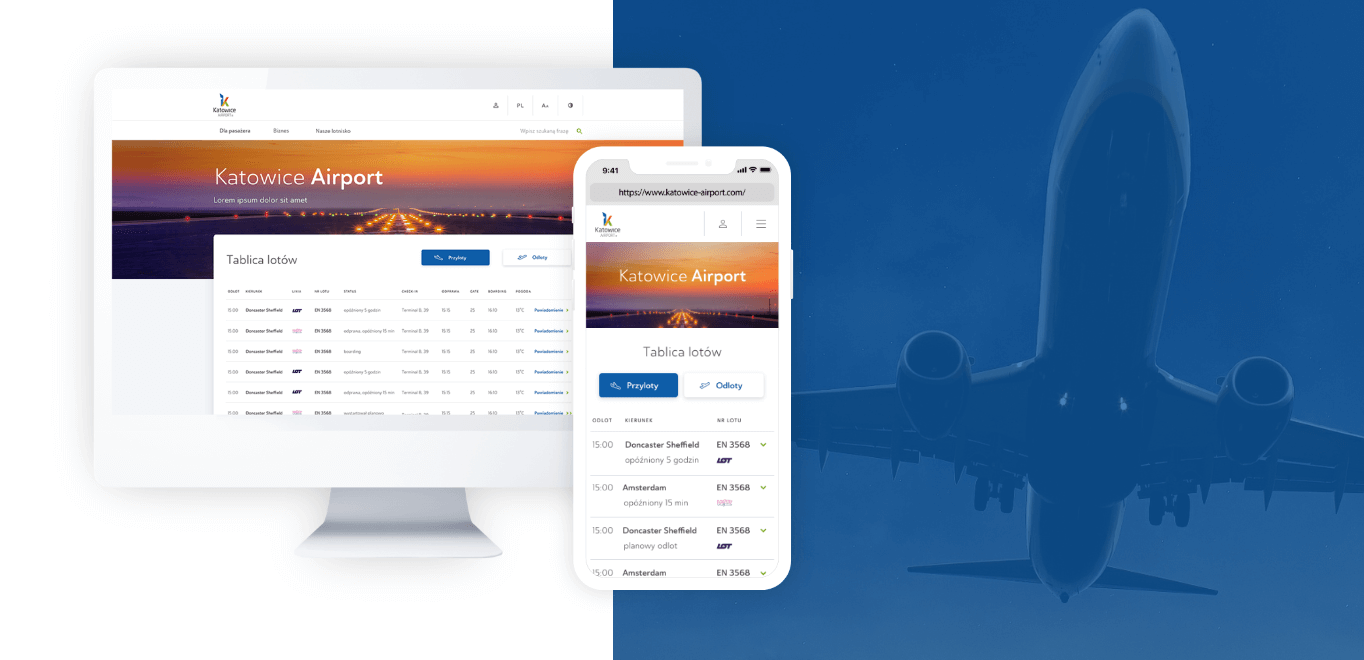
The number of virtual tutorials, articles or entries about how to create a mobile website can literally make you dizzy. The growing importance of mobile services and solutions in almost every industry means that this topic is being addressed literally everywhere. We also decided to show you how it is done step by step on a particular example. See how the service was created from the brief and the client’s assumptions up to its publication. We prepared for you a case study of the new Katowice Airport website.
The basic assumption we made was to build a new website of Katowice Airport, which would allow users to efficiently and intuitively reach all interesting information. The airport service had to be simple and legible, but at the same time visually attractive. An important aspect was also the response to the airport’s business expectations, i.e. the sale of additional services, parking and flight reservations, as well as the user’s needs.
Design process
The tasks had to be planned in such a way that several teams could work at the same time. We had to take into account the specification, UX, backend, creation and frontend. Of course, at this stage we couldn’t miss an analysis. We analyzed the client’s brief, data from Google Analytics and current service. Then we talked a lot with GTL (Górnośląskie Towarzystwo Lotnicze – the company managing the Katowice Airport) about needs of the business and users. At this point we were able to start working on the exact specification and models for the service.
We analyzed data from Google Analytics. It turned out that more than 70% of users entered the site using a smartphone. We decided that the starting point would be the mobile version of the website. We created mock-ups of the website, i.e. a clickable prototype showing how exactly all user interactions with the website would look like. In total, there were over 170 views of the mobile version. On this basis we extracted about 40 subpage templates, which helped us to create the rest of the website subpages.
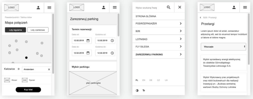
We started the stage of designing service layouts from creating the so-called UI KIT, i.e. a set of all elements used within the site: buttons, form fields, checkboxes, navigation, header styles, etc. Thanks to this, we were able to efficiently “assemble” subsequent views based on previously prepared elements. As part of designing final layouts of the website, we designed the appearance of over 70 subpages in different resolutions. The scope of work included designing: layout of subpage templates, maps and airport plans as well as mailing and booking confirmations.
Usability studies of the service
While working on the service we prepared usability studies, which helped us determine what else we can improve on the new website. The group of respondents consisted of not very advanced internet users. We wanted to check how a person with an average technological knowledge copes with the site. The participants received scenarios containing three tasks to be performed. The research was conducted in the presence of a moderator. After completing the tasks, the participants were asked to fill in a questionnaire and the moderator conducted an interview with each of them based mainly on open questions about their impressions of the website.
Users were divided into two groups. After conducting the survey with the first group, we decided to make some minor improvements (e.g. adding the “search flight” button on the flight board or renaming the tabs in the menu). In the next group of respondents, the introduced corrections minimized the noticed problems practically to zero. What is important, the general impressions of the surveyed users were positive. According to the participants, the website was legible and easy to use, aesthetic and had an intuitive information structure.
Functions scrutinized under a magnifying glass
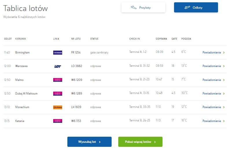
We started the scrutiny with the most popular website features. According to Google Analytics, the flight board is the most visited subpage in the whole site. We have approached users and placed the flight board in the most accessible place – at the top of the main page. Thanks to this, users have direct access to the most important and up-to-date information about the nearest flights. We have also placed a sales panel on the homepage. Thanks to this, the user can quickly and efficiently book a parking lot, find a hotel or flight. The panel is integrated with partner services, such as eSky or booking.com. The business needs of the airport in the context of the website are mainly based on the sales of parking lots, additional services and flights. Therefore, on the new website you can make a purchase or reservation not only from the level of the sales panel, but also from numerous subpages linking to the purchase process.
In the new website we have also created a detailed and interactive terminal plan. The user can explore further areas of the airport looking for points of interest or select a category from the list, e.g. “baggage check-in” to see where they can find it at the airport.
Messenger will help you
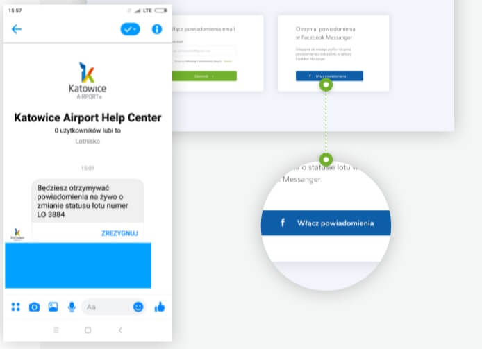
If you are interested in the status of a flight, you can receive notifications in the most popular messenger in the world – Facebook Messenger. All you have to do is click on the ‘status notification’ button from the flight board and log in to your Facebook account.
Another important component of the service is the flight schedule, which is an advanced search engine allowing you to find your flight. The level of detail of filtering allows for very precise identification of the flight sought by the user. Directly from the search engine level, the user can proceed to purchasing the flight ticket.
We also took care of a new booking system, which allows you to quickly and efficiently purchase a parking space or particular service. Thanks to dynamically counting prices in the side panel, the user can immediately see what is the cost of the chosen reservation. A summary of the whole “activity” on the website can be found in the customer’s profile. In the My Profil tab the user has access to all information related to his account, detailed booking history and available discount codes.
The airport website must be accessible to everyone, so we made sure that it is as accessible as possible for disabled people. Thanks to high contrast, enlarged texts and the possibility to move around the entire site using the keyboard, we have increased the accessibility of the site to 100%.
Nomination for Mobile Trends Awards 2019
The final effect met the customer’s expectations and – most importantly – perfectly fitted into the mobile structure. The entire website is responsive, intuitive and easy to navigate on mobile devices. It was also appreciated by industry experts who nominated our project for the Mobile Trends Awards 2019, i.e. the awards called the Oscars of the mobile industry. We are nominated in the category of website or mobile service. The results will be announced on 12 March 2020 during a gala in Kraków.
The new Katowice Airport service was a big challenge not only for our UX/UI Designers department, but also for programmers. The technologies used in the project are PHP7, Laravel 5, JavaScript and HTML5, but this is a completely different story.